ThinkPink
Project Type:
Personal
Strategies:
User Research, Personas, Competitive Analysis, Feature Brainstorming, Styleguide, Wifreframing, Prototyping
Timeline:
Feb - May 2019
Tools used:
Figma
Project Type: Personal
Strategies: Research, Branding, UX/UI Design, Prototyping
Timeline: Feb - May 2019
Tools used: Figma
The Pink Tax refers to the "extra charges placed on products and services directed toward women."
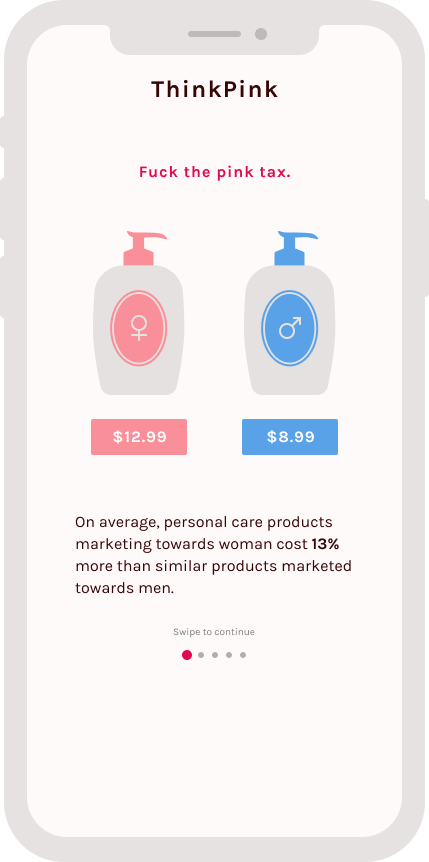
As of 2019, Women on average pay 7% on everyday items including clothing, toys and accessories, personal care, and health care items. Personal care products targeted for women cost an average of 13% more. This, along with the gender wage gap, makes it more difficult for women to live day-by-day.
As a feminist, consumer, and a person who this issue directly targets, I wanted to explore this issue and use my design skills to hopefully ease this tension.
Research
The first thing I wanted to understand was the general public’s awareness of this issue. How much do people know about the pink tax? Are they making any changes to their consumer habits based on their knowledge?
User Interviews
I initially interviewed 6 users, all within NYU and mostly in young and female demographics. I asked questions mostly about their shopping habits and their knowledge of the pink tax and found that:
People know only a few things about the pink tax
Most women do not shop in the men’s sections
People rely heavily on online reviews and recommendations from friends
Customers have brand loyalty, but are open to exploring new options
People care about ingredients in a product, but do not know how ingredients affect them
Persona
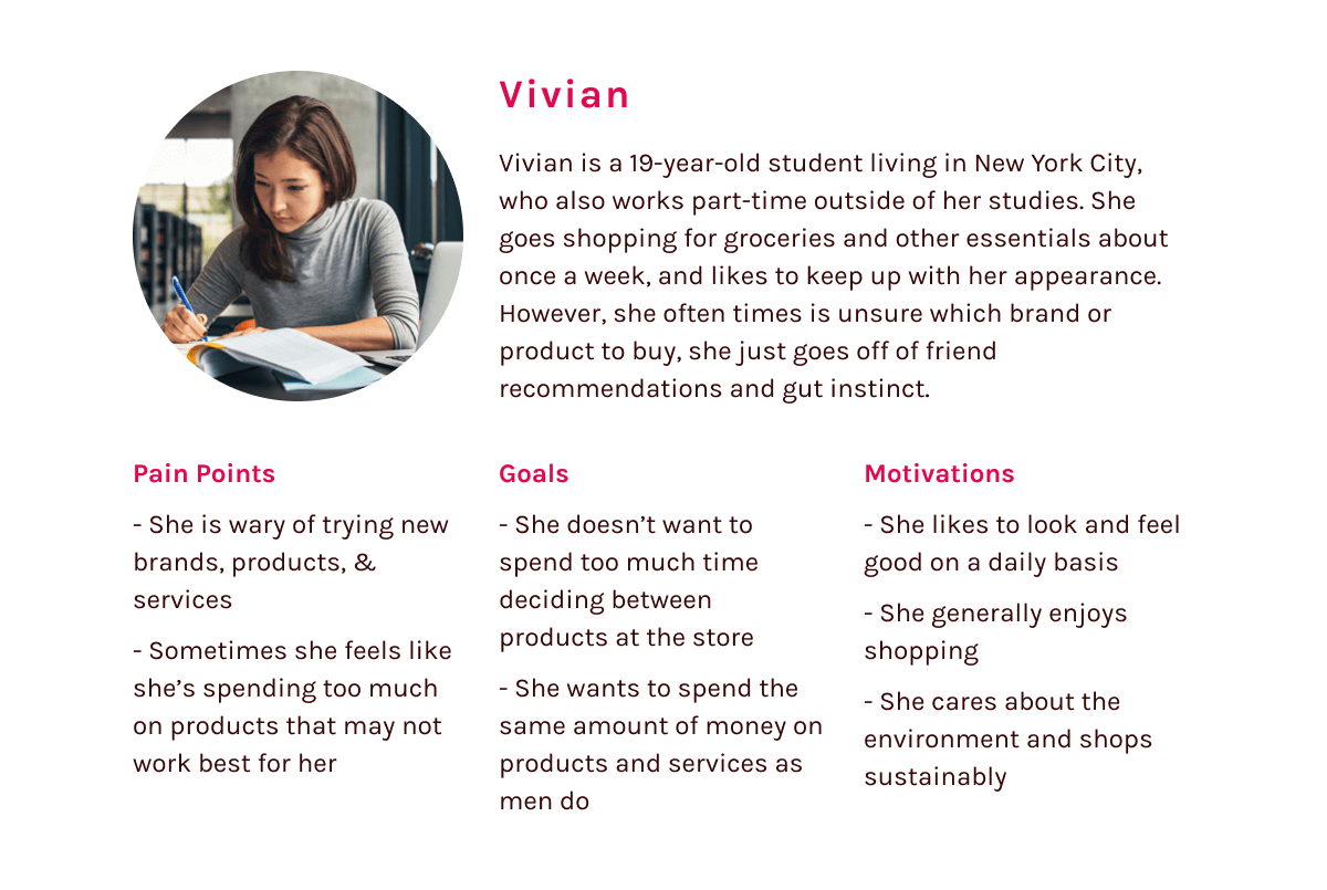
From there, I developed a persona based off of my research.
Discovery
With a better understanding of the problem and general reaction, I formulated a problem statement and hypothesis.
Problem Statement
Women need a way to easily compare the quality and price of their purchases, because they want to save money and spend the same amount for said items as men do.
Hypothesis
I believe that by creating a feature that can evaluate and compare similar items marketed for different genders, we can promote gender neutral shopping and help consumers save money.
At this point, I started to think of an ecommerce product as a potential solution. Since the pink tax covers essentially every area of consumerism, I knew I needed to narrow my scope. I decided to focus on personal care products, since 1) the industry has the highest discrepancy in pricing and 2) personal care and hygiene impacts everyone.
Competitive Analysis
To find out what was missing from current commerce experiences, I looked at popular retailers, specifically Target and Amazon, to see if they were doing anything to disrupt the pink tax.
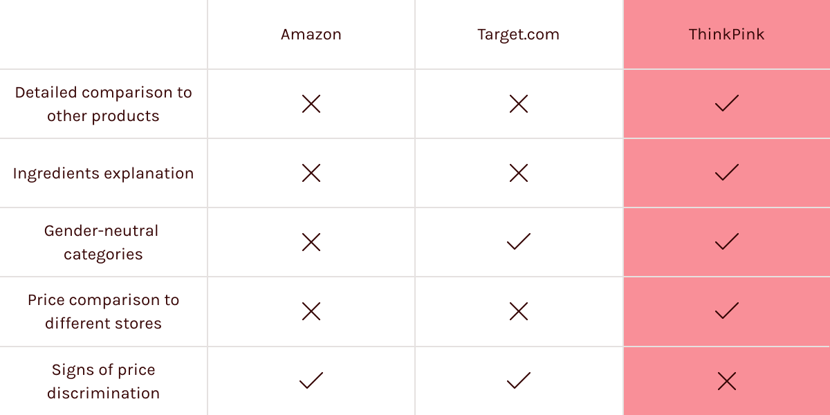
Long story short, popular retailers contribute to this discrimination by categorizing their products into gender categories and aren’t doing much to help and inform their customers, particularly women.
Feature Brainstorming
With this in mind, it was time for me to formulate a solution. I did another round of interviews to determine what users would look for in a digital product for personal care.
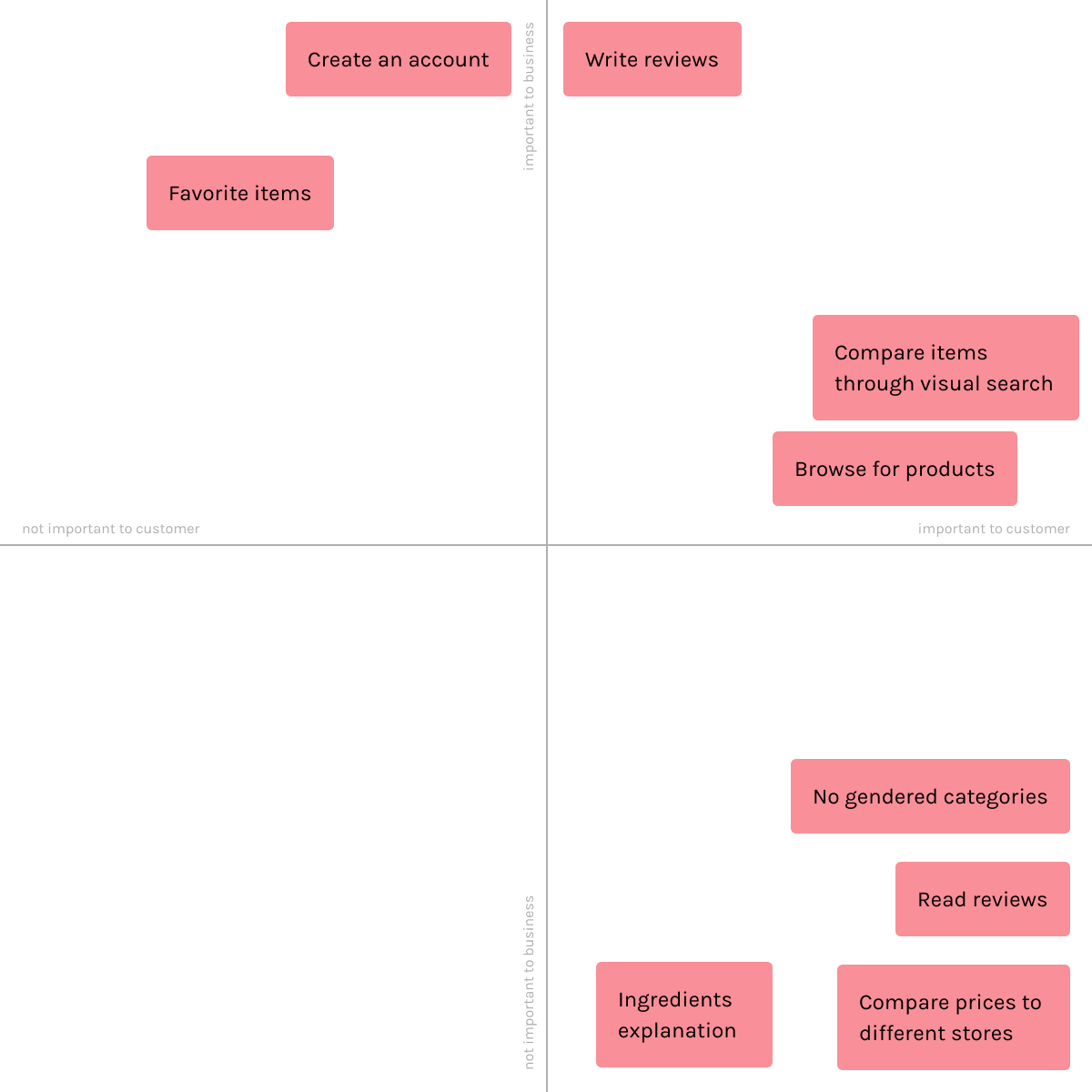
From here, I realized that a mobile app would be the best medium, since most people buy their products in person, an on-the-go solution would be more useful.
The Product
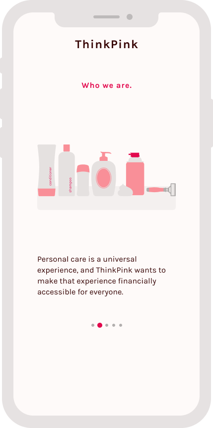
ThinkPink is a company founded by women, for women, with an aim to raise awareness about the pink tax at an individual level. We know that personal care is a universal experience, and ThinkPink wants to make that experience financially accessible for everyone.
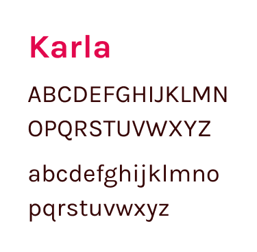
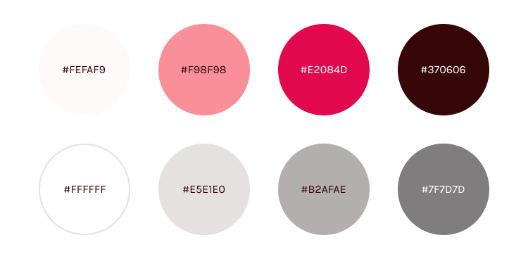
Styleguide
Onboarding
Step 1
Step 2
Step 3
Step 4
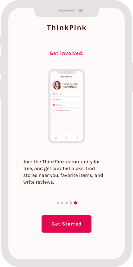
Step 5
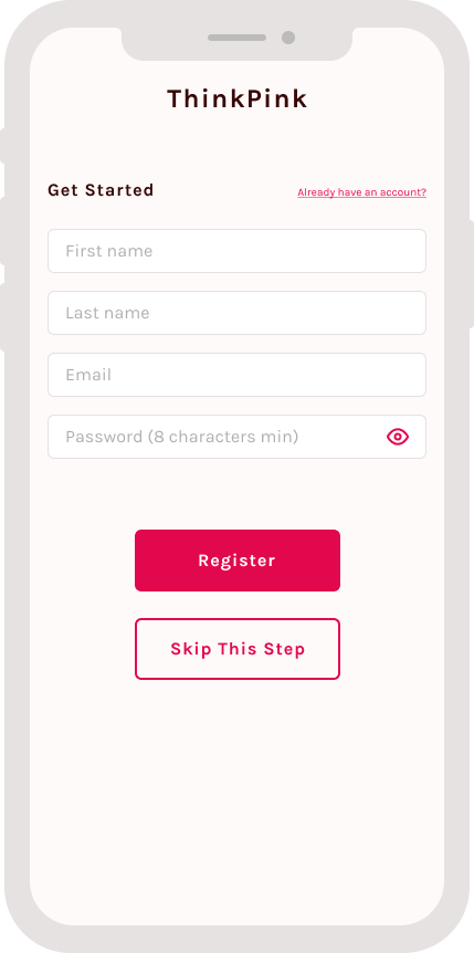
Step 6
Compare
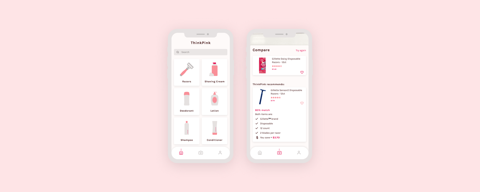
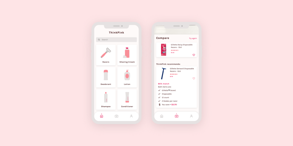
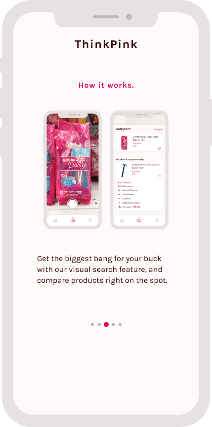
You can use the ThinkPink app on-the-go, if you see a personal care product and want to know if it’s the best bang for your buck, use our visual search feature and cutting-edge algorithm that detects similar descriptions between your product and other products and gives you a percentage match!
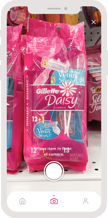
Step 1 - Take picture
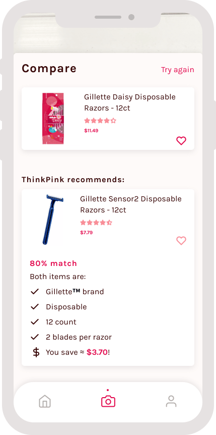
Step 2 - Compare products
Browse
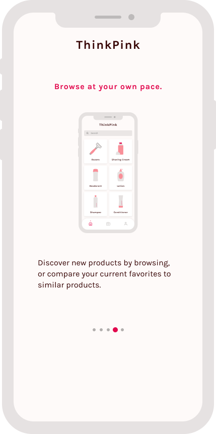
Or, you can discover new products casually, and see if your current favorite products are the best matches for you! I chose the categories based off of the New York City Department of Consumer Affairs study.
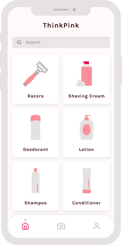
Step 1 - Select a category
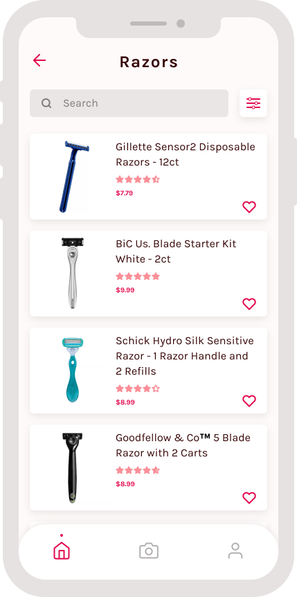
Step 2 - Select a product
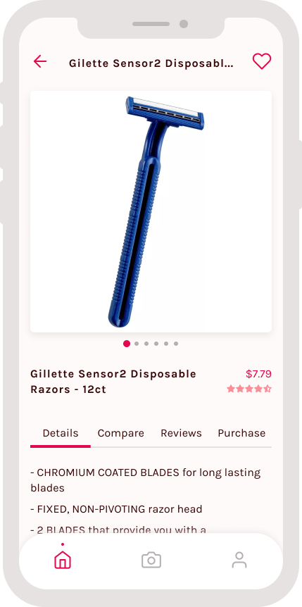
Step 3 - Product page details tab
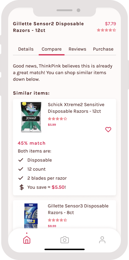
Step 4 - Product page compare tab
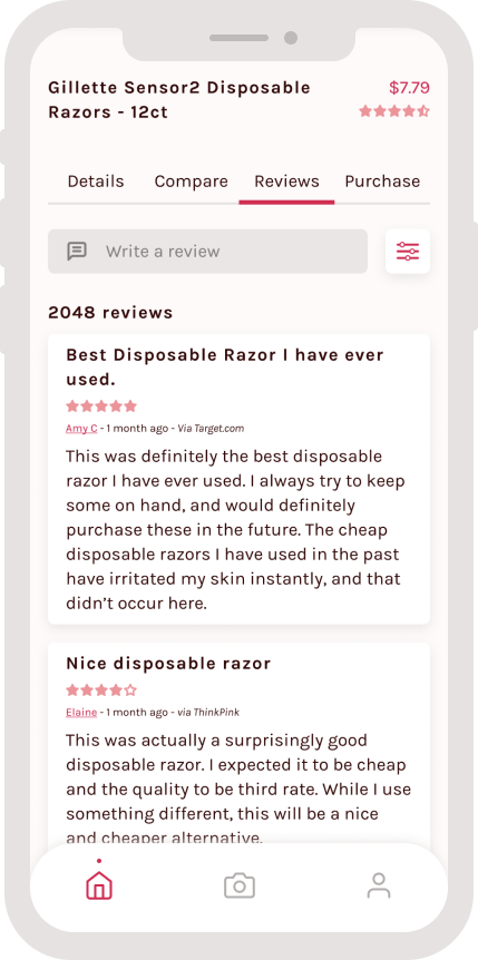
Step 5 - Product page reviews tab
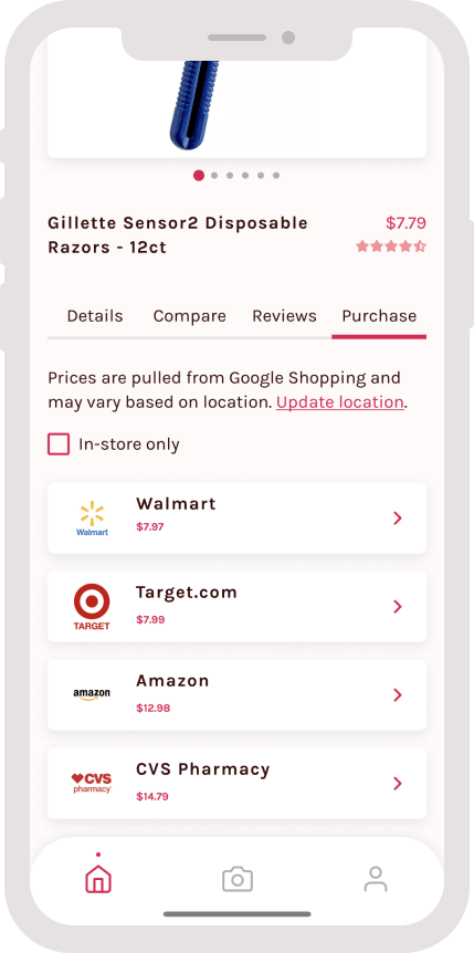
Step 6 - Product page purchase tab
Account
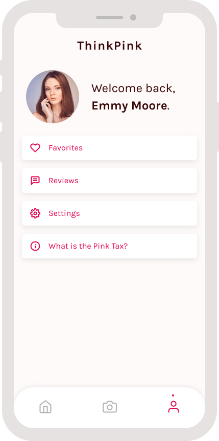
Register an account and get curated picks, find stores near you, favorite items, and write reviews!
Conclusion
For the future, I would love to explore the account features more, since that wasn’t a huge priority for the MVP. I think that adding some sort of social media aspect would be cool since it would allow users to have more discussions on the pink tax and share their recommendations to each other better.
I also haven’t done any formal usability testing yet, but in the meantime you can interact with the product here (and maybe provide feedback if you have any).
Overall, I learned a lot from this project and leading a full UX design process from research, wireframing, prototyping, to branding.
